
#071
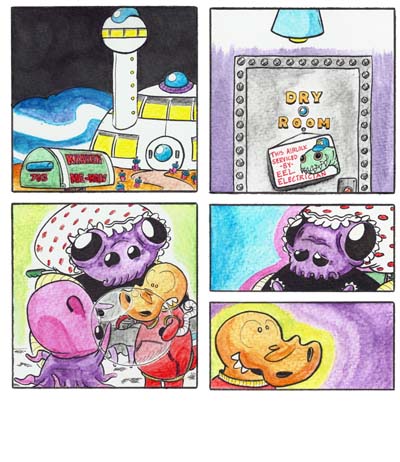
A maybe-or-maybe-not-so-subtle change in the process for today’s comic: the lettering was done digitally. My hand lettering looks pretty bad, I think, and I was kinda hoping it wouldn’t look as bad if I made a hasty compooter-font out of it. But it still looks . . . ergf. The speech bubbles were a challenge.
But the advantage of producing it like this is that then I have a whole uncluttered real-page. See?
And that looks kinda cool, I think.
Still, I don’t know if I should be getting better at hand lettering or getting better at digital lettering . . . or forsaking the written word entirely, as it inevitably narrows one’s audience and crowds one’s panels and appends a base “c-” and a lecherous “-oon” to one’s art, rendering it a mere “cartoon.”
EDIT: I just realized that I did the speech bubbles using the pencil tool instead of the brush tool, since those are my pixel art settings. It was a stupid mistake, and it kept the speech bubbles from anti-aliasing. Basically, I messed them up and they look worse than they should. I’ll try them again on the next comic.
Wow Jimmy! I just went through all your comics tonight after work. I was so engrossed I haven’t even stopped to eat dinner and it’s about 9:30. I hope I get to talk with you more at work. You could teach me a lot!! Awesome work!!
Thanks, Eddie. I feel bad for making you skip dinner.