
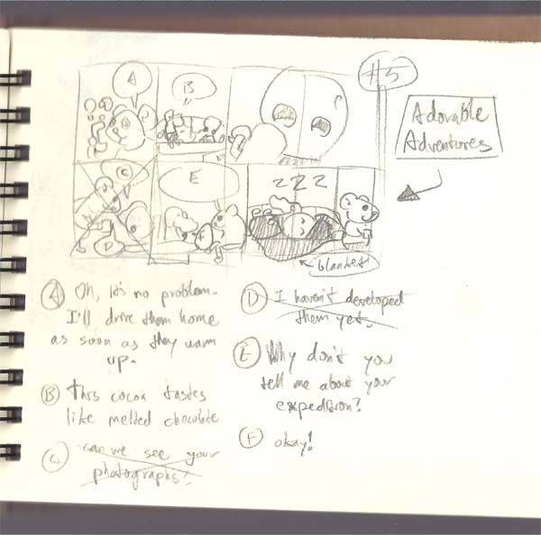
#026
Part 5 of 5! This concludes the wintry expedition, safe and sound asleep. I know it’s warm and springy around where I live, but I’ve got one more snow-comic up my sleeve, so just pretend you live further north when you see it on Wednesday.
Below, you can see the promised process post and understand just how amateurish this is. Cool! Have a good one.
– jimmy g.
________________________
I love when artists make process posts. I’ve learned a lot from them: tools, techniques, computery mumbo jumbo . . . So here’s how I make Dinosaur Kid. It’s pretty simple, but I’m learning new things often, so this whole process is flexible.
First I draw a small version of the comic, just playing with lay-outs and writing. I have a small sketchbook just for Dinosaur Kid stuff, so that’s where I do that.
You can see I moved some stuff around and added some stuff, but the same spirit’s there.
After that, I get a piece of bristol board and pencil the whole thing pretty lightly. I’ve been drawing on 9×12, though the first 10 or so comics were on cut-up fourths of 14×17. Our scanner’s barely bigger than plain paper, so I usually have to scan in the top half and bottom half of the comic and then put them back together on the computer.
I’m really not confident making permanent marks with a pen, so I pencil almost everything as it’ll appear when inked. But I’m getting better about doing small details in ink only, which saves some time.
Anyway, I draw right over the pencil with a brush pen. I’ve been getting mine off of jetpens.com, except for a couple that my mom gave me for Christmas. I like them a lot, and I think they improve the overall look of the comic. I’m still learning to control ink flow and line thickness, though. Here’s a penciled panel with ink on top.
You can see the lettering moves around. That’s one of my biggest weaknesses, I think. (If the blacks here look duller, it’s because I scanned it in grayscale. But I’ll get to that in a minute.)
Once everything’s inked, the pencil lifts right off with an eraser. I use a kneaded one that I got in high school, since it doesn’t make a bunch of rubbery shavings.
Man, it looks pretty grimy at such a high resolution. When I need to ink a lot of stuff, like Dinosaur Kid’s pants or a black background, I use a marker. I’m not good enough to do it with a brush yet.
Anyway, once the pencil lines are gone and everything’s inked, I scan it in two halves and reconnect them in Photoshop 7 (vintage, right?). I scan at 600 dpi, or “dots per inch,” so it’s really big and detailed at first. I scan in black and white, too, which is important. Since the computer is rendering the image with so many dots that are either (a) black or (b) white, it discards any light pencil lines I might’ve missed and totally intensifies whatever ink is there.
The next step is to resize it so it isn’t enormous and in-yo-face, but there’s one other thing first. Scanning in black and white makes it a bitmap image, and I’ve found that bitmaps look terrible when you resize them. Because the pixels are only black or white, it makes hard edges along all of the curves, giving the whole thing a jagged and pixelated look. So I convert the image to grayscale first. That way, when it’s shrunken from 5000 pixels wide to just 800, it can introduce shades of gray to soften the curves.
I didn’t make pictures for this part, so it’s probably pretty boring to read. Oops.
Always nice seeing the process!